Developing the depot_ branding

As you know, our architectural design studio has been transformed into a cutting-edge art gallery and creative hub called the depot_. The brand needed to have a strong visual identity that fully encompassed this wide-reaching project and expressed the diversity that people would experience when visiting the depot_, while still being approachable and playful.
We collaborated with our good friends Ian Pitt of Me, Him & Her and Matt Dew of 113 / Creative, who developed a flexible brand identity that can be applied across the diverse range of activities and experiences offered within the depot_.
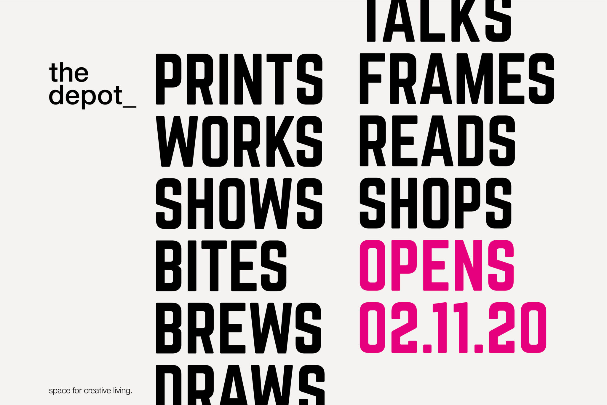
They designed a bold, letterpress-inspired typography, along with messaging that talks holistically about the depot_ as a whole, but that can also be used to highlight each individual event and experience as needed.
The bold colour palette using mostly, but not limited to, CMYK, pays homage to its print and art heritage, complemented by the minimal interior of the space.
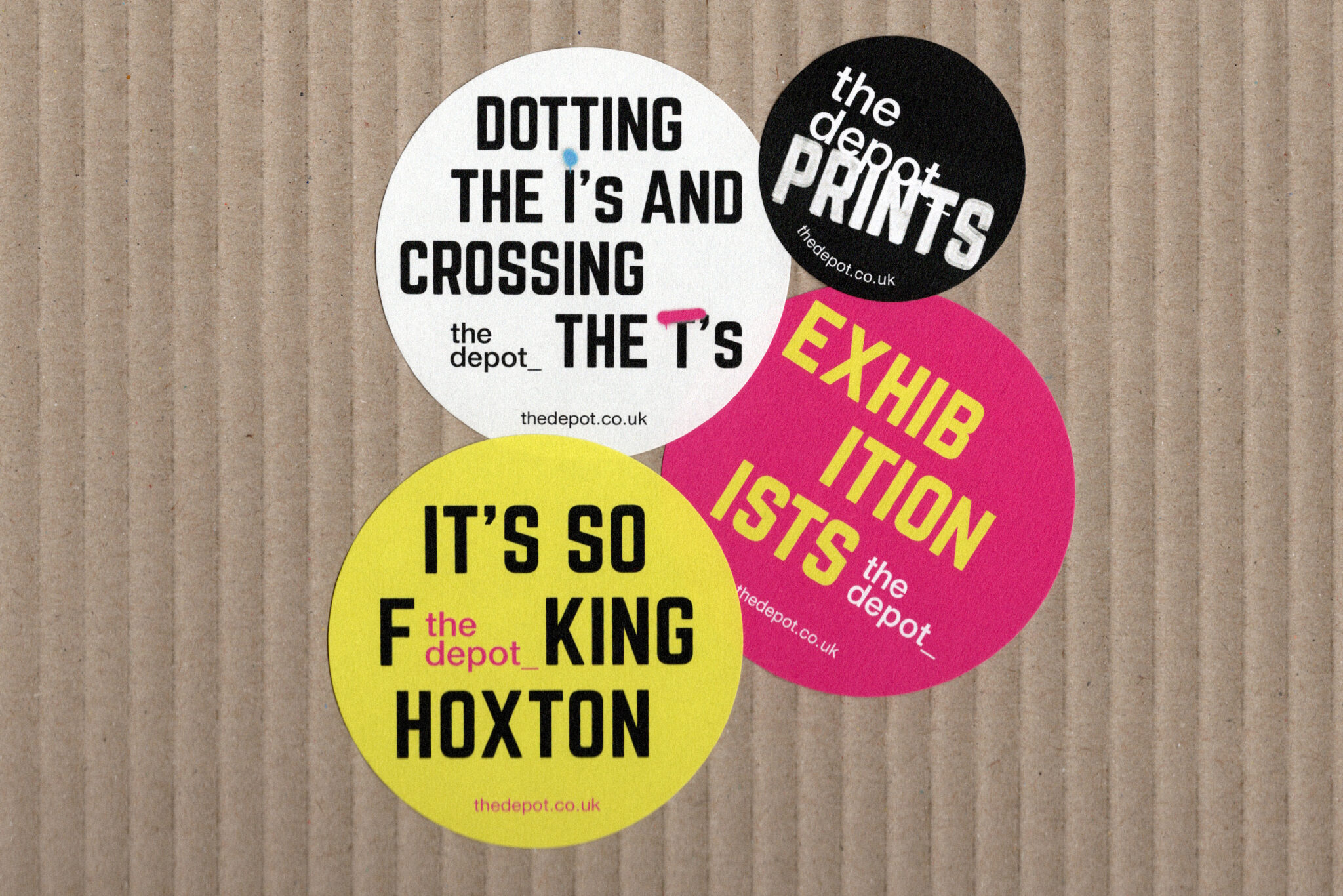
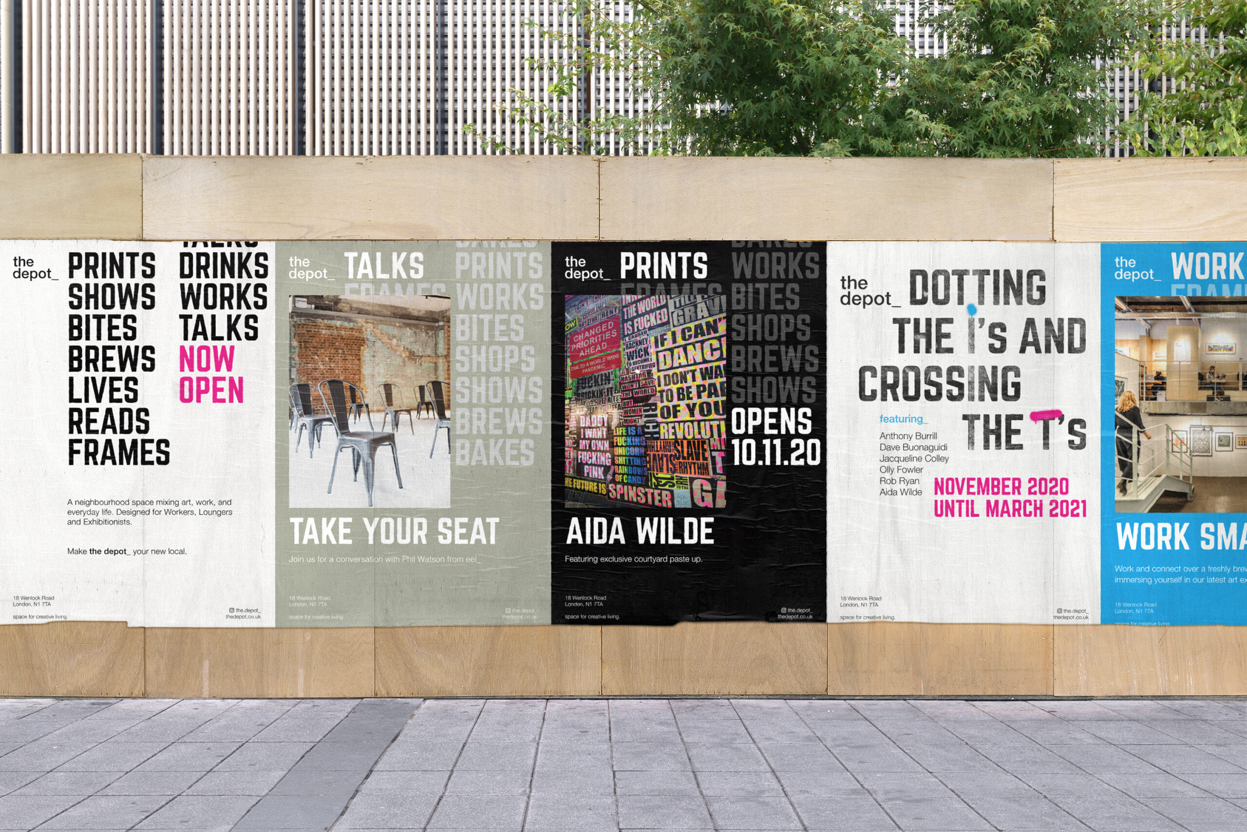
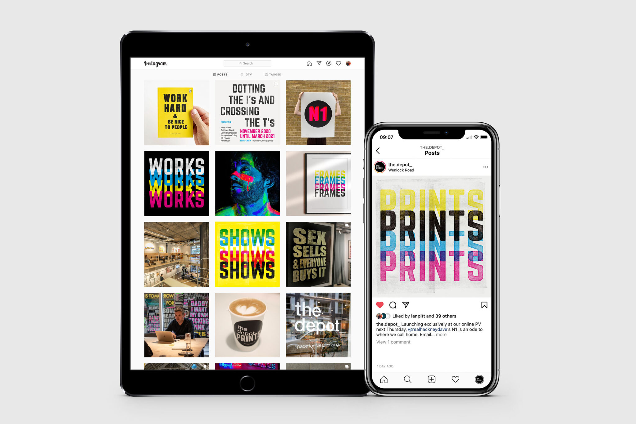
Me, Him & Her and 113 / Creative have designed and implemented the brand identity across a whole range of print, signage and digital touchpoints from promoting the gallery shows, exhibition catalogues, cafe packaging and social media content.
The strong typography behind the branding worked serendipitously with the inaugural exhibition at the depot_, ‘Dotting the i’s and Crossing the T’s’, which showcased the work of six contemporary artists working within typography today, including Anthony Burrill, Aida Wilde and Rob Ryan. The wide spectrum of work, from slogan flags to neon postcodes, highlights that it’s not just what you say, but how you say it – something at the very heart of the depot_.